Terra Dotta · Director of UX & Design (via Smashing Boxes)
A travel safety app that actually keeps students safe.
A four-year-old travel safety app was serving three audiences with one broken navigation pattern. I rebuilt it from the IA up, and it shipped to 700+ institutions worldwide.
- App store rating
- 2.8 4.2
On this page
The problem
Terra Dotta’s Alert Traveler was a mobile travel safety app that had been live for four years. It served over 700 higher-ed institutions and thousands of student travelers, but it had aged poorly. Built on Angular, the UX couldn’t keep up with the growing feature set and three distinct audience types. Terra Dotta the company, the institutional admins managing travel programs, and the students on the ground.
The app worked. It just didn’t work well. A full rebuild of the UX, UI, and technical stack was overdue.
The process
I was the Director of UX & Design at Smashing Boxes, and Alert Traveler was a client engagement. We approached it in four phases.
Discover
I started by deconstructing the existing app. Every screen, every flow, every piece of IA. The honest assessment was that most of it needed to go. The architecture had accreted features without a unifying structure, and the visual system was four years out of date.
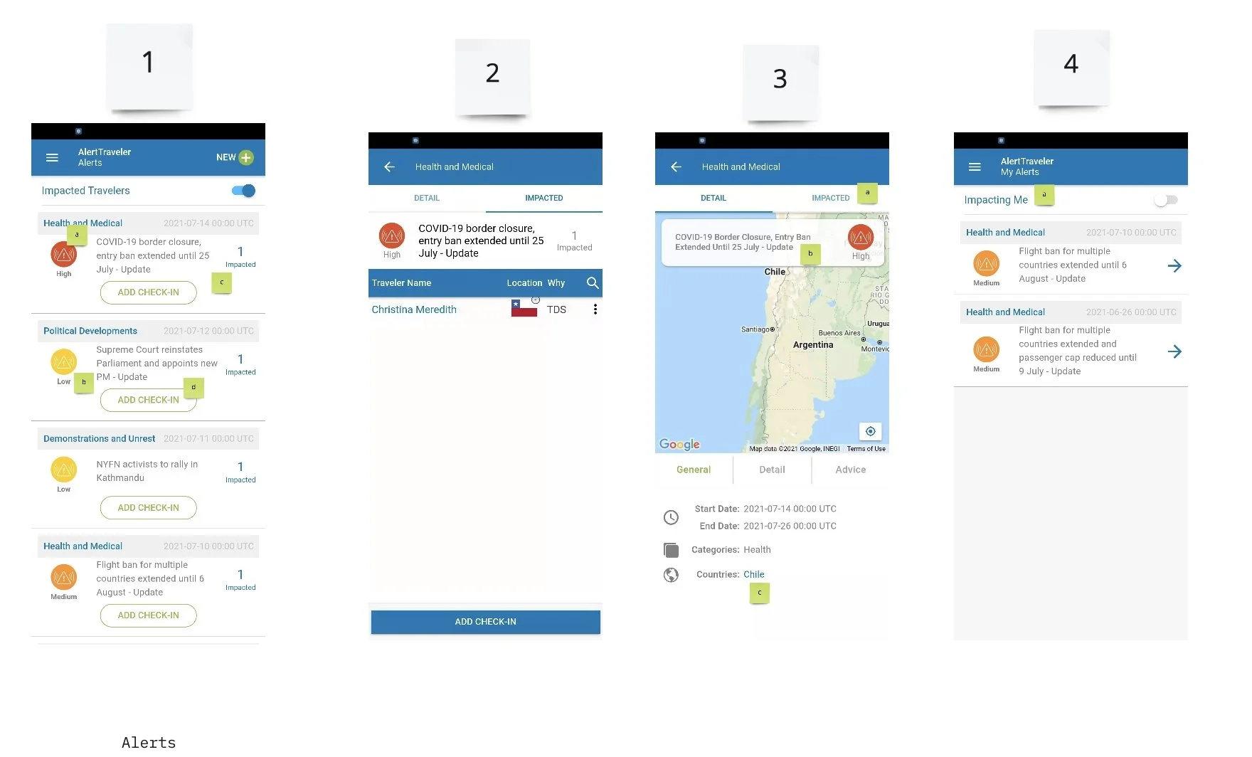
Client research ran in parallel. Terra Dotta needed to serve institutional admins, the people managing travel programs, setting alerts, and configuring the tool. But the end user was the student on a semester abroad. I interviewed both.
Define
The output of discovery was a comprehensive user journey map, a new information architecture, and a set of user flows for each audience type. I also defined net-new features, things the old app couldn’t do that the research surfaced as critical.
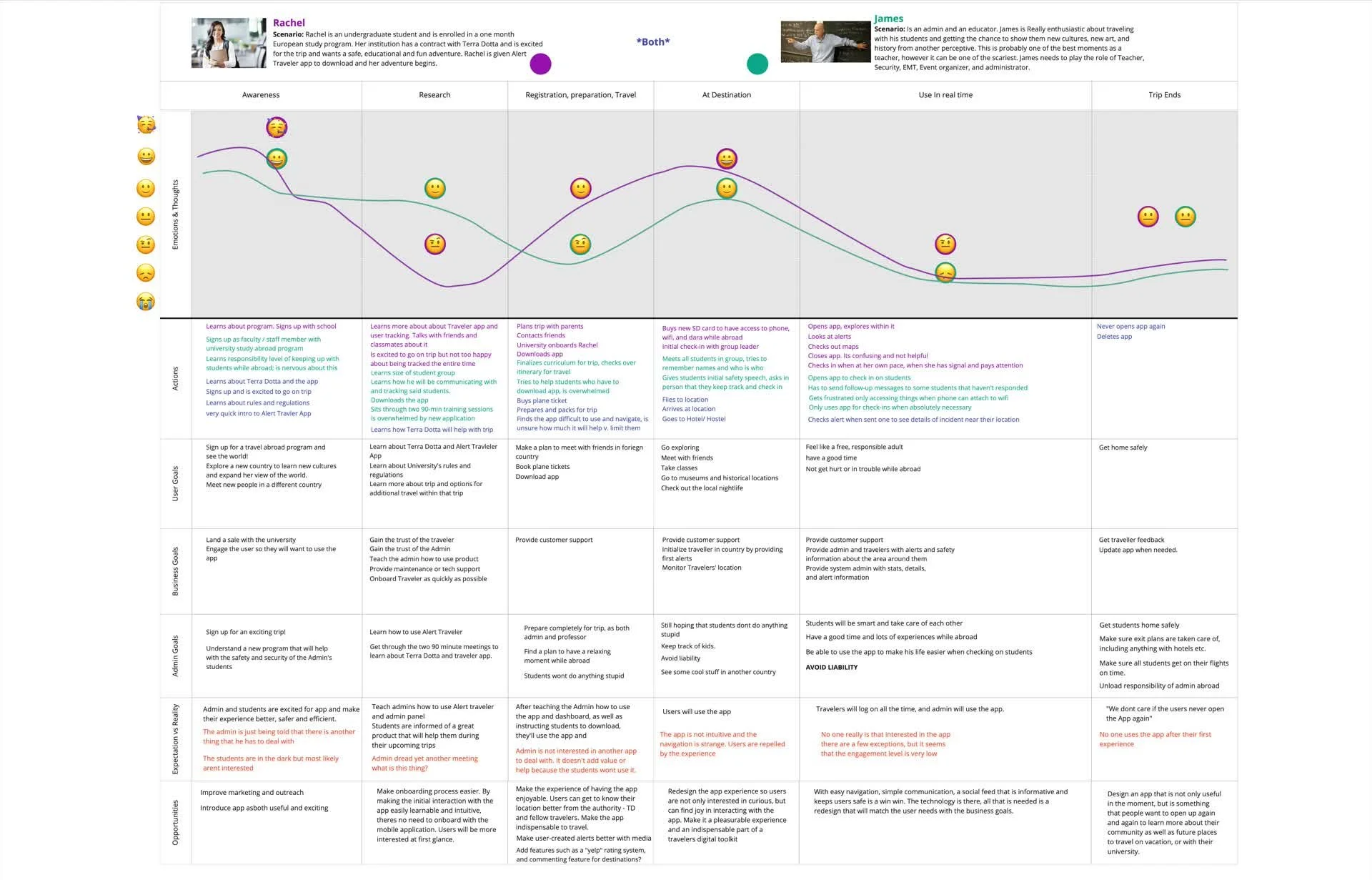
The IA alone took a week of whiteboarding. Three distinct audience types, one app. That meant three distinct information hierarchies, three distinct navigation patterns, and a visual system flexible enough to accommodate all three without feeling like three different apps.
Design
I ran a heuristic evaluation of the Angular app to identify the most egregious UX issues, things we couldn’t wait for the full redesign to fix. Then I moved into wireframes in Miro and high-fidelity UI in Figma.
The visual system needed to do two things simultaneously. Feel trustworthy and institutional for the admins, and feel approachable and helpful for the students. I landed on a clean, card-based UI with strong typography and a restrained color palette. The admins got dashboards and configuration panels. The students got a streamlined safety feed, check-in flows, and location-based alerts.
Deliver
The technical migration was Angular to React Native. I provided design oversight for both the domestic and offshore engineering teams, with weekly design reviews, ad hoc guidance, and final sign-off on shipped features.
One call I made that mattered was pushing back on the offshore team’s default to reuse the admin dashboard components for the student-facing app, because it was faster to ship. I held the line on separate component sets for each audience. The two groups needed different information density, not just different skins.
Not one app wearing two costumes.
The outcome
Alert Traveler shipped on the App Store and Google Play, rebuilt from the ground up. It serves 700+ institutions and sits in the pockets of thousands of students worldwide, keeping them safe on their academic adventures. App store rating climbed from 2.8 to 4.2 in the two quarters after relaunch, the clearest signal that “it worked, it just didn’t work well” was actually fixed, not just modernized.
The IA decision to keep three audiences distinct instead of collapsing them into one navigation pattern is the piece I’d point to if you asked what separates a rebuild from a reskin.
What I’d do differently. I’d have set the audience-separation rule on day one instead of enforcing it mid-build. The offshore team’s shortcut was predictable, and I should have made the call before they did.
Not bad for an Angular app that was four years past its prime.