Terra Dotta · UX Manager
A CRM built for the students study abroad forgot.
Study Abroad offices were losing the students who needed them most. I built the CRM, solo, that put accessibility and DEI into the product before a single screen existed.
- List building
- ~1 day Under an hour
On this page
The problem
Study Abroad offices were stuck. They had hundreds of students who didn’t fit the cookie-cutter study abroad profile, first-generation students, STEM majors, students on financial aid, and no way to engage them at scale. Manual emails, spreadsheets, and institutional inertia meant the students who needed the most outreach got the least.
Terra Dotta had deep domain expertise in ed-tech but no CRM application. The company brought me in, first through Smashing Boxes, then in-house after the engagement, to build one. As the sole designer.
Accessibility and DEI were foundational from day one. This wasn’t going to be a CRM with an accessibility review tacked on at the end. It was going to be built for the students who had been left out. And Engage was born.
The process
Discover
I already knew the ed-tech space from Alert Traveler, so I integrated with the product team on day one. No ramp-up. No discovery theater. I sat with product managers, read the competitive landscape, and started mapping user flows.
Define
The research surfaced three distinct audiences. The Study Abroad offices running programs, the advisors working directly with students, and the students themselves. I wrote user stories, drew on a background in marketing communications to shape the tone, and validated personas through Terra Dotta’s Customer Advisory Board.
I also led the DEI board, a group of stakeholders from across the company focused on making sure the product served underrepresented students. That board shaped the product’s voice, its feature priorities, and its commitment to accessibility.
Design
I worked sprint-parallel with engineering: wireframes one sprint, high-fidelity UI the next, design reviews the following week. Nothing sat in a handoff doc, and nothing waited on a waterfall.
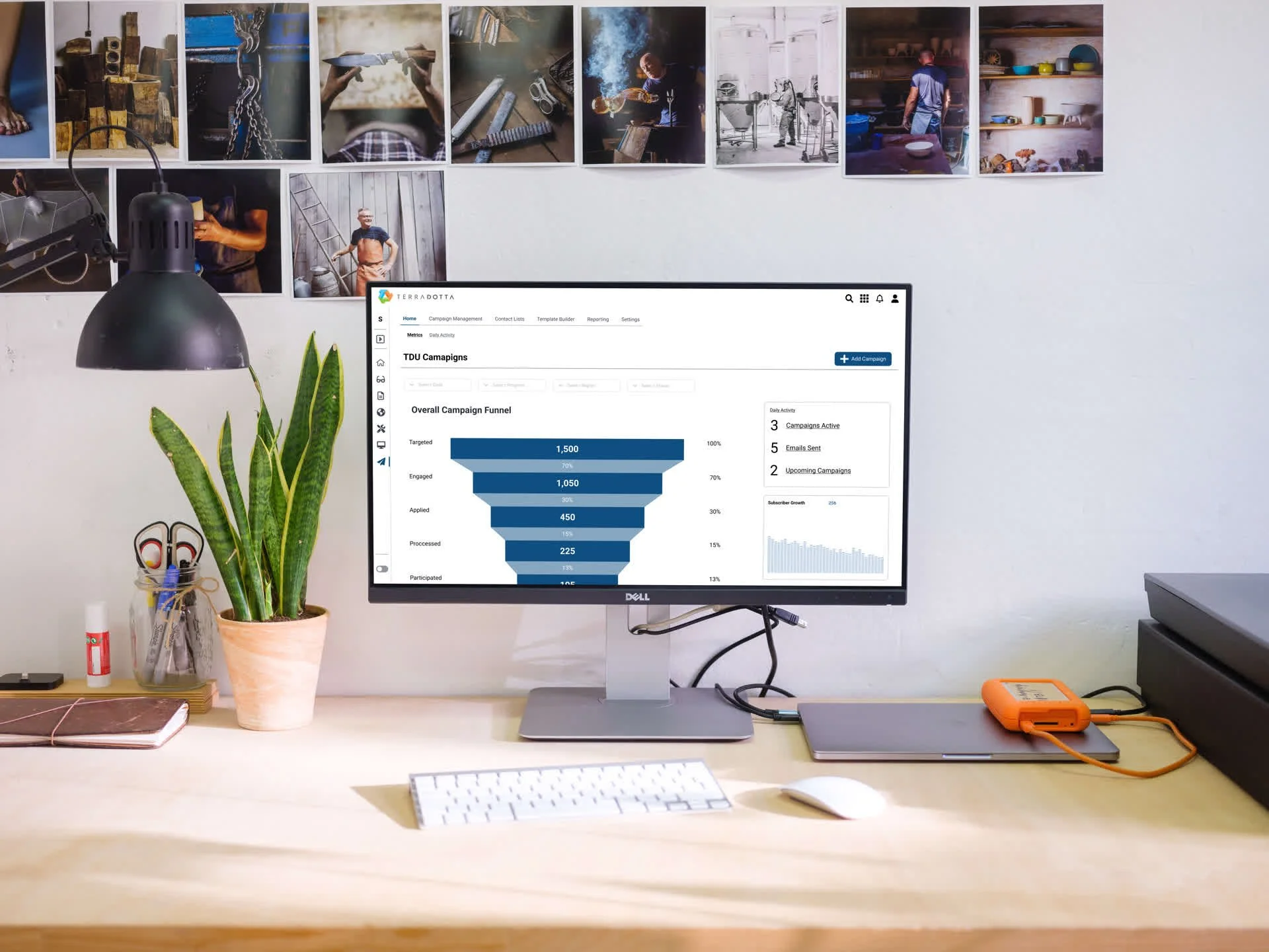
The technical stack was Angular, which was new to me. I learned it. Zeplin for developer handoff. Storybook and Chromatic for the design system. I abandoned Material early — it was too rigid for what we were building — and designed a custom component library from scratch. That library became Terra Dotta’s first design system. It shipped with the product, documented and versioned.

Deliver
I provided weekly design guidance during active sprints and ad hoc support between them. The product launched in beta with real customers, and I iterated based on their feedback.
The outcome
Engage shipped in beta with 15–20 Study Abroad offices in the first cohort, covering students who didn’t fit the standard profile. First-gen, on financial aid, STEM majors carrying lab schedules that didn’t map to a semester-abroad calendar. Advisor outreach that used to happen through manual email lists went through Engage’s segmentation instead, cutting list-building time from about a day to under an hour.
It’s now a core Terra Dotta product, and the component library I built for it became the company’s first documented, versioned design system, used by every product team that came after, not just mine.
What surprised me was that the DEI board I led ended up shaping more roadmap decisions than the UX research did. Stakeholders who weren’t designers were better at spotting who Engage would fail than my own personas were.
What I’d do differently. I’d have brought the DEI board into testing from the first sprint. It took me a round to start testing directly against their objections.
I hate the buzzword “inclusive design.” It’s not a feature; it’s the thing that ships.