Second Nature · Director of Digital Experience
Making air filters seem sexy.
A commodity air-filter brand was losing to whoever had the better ad that week. I rebuilt the shopping experience around one idea. A spec sheet isn't a brand. Conversion jumped 60%.
- Conversion
- Industry average +60% above baseline
- Click-through
- Industry average About 2x
On this page
The problem
Second Nature was a national air-filter brand selling a commodity product in a category where nobody wins on product differentiation. The subscription model was solid. The product quality was real. But every touchpoint felt like a utility. Customers landed on a PDP that read like a spec sheet, ghosted, and went back to Amazon.
The brand edge existed but was invisible. Premium positioning, real quality, and a genuinely useful subscription service sat underneath a shopping experience that undersold all three. They were paying industry-average CPC and converting at industry-average rates, which is to say they were losing to whoever had the better ad placement that week.
The process
I audited the site into its discrete parts, every page, every flow, every piece of copy, and documented what worked, what didn’t, and what was missing. That audit became the foundation for four threads that ran together over about nine months.
The existing site treated every page the same way. Header, spec sheet, footer. I mapped the full shopper journey from ad click through subscription renewal and found the surface that mattered most hiding in plain sight. The filter quiz identified what customers needed but had been built like a form instead of the sales tool it actually was.
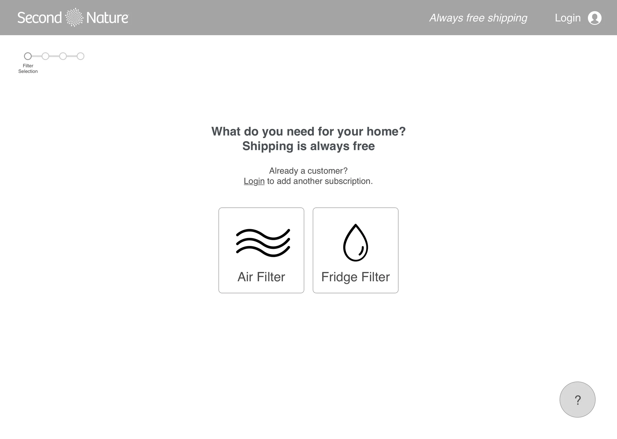
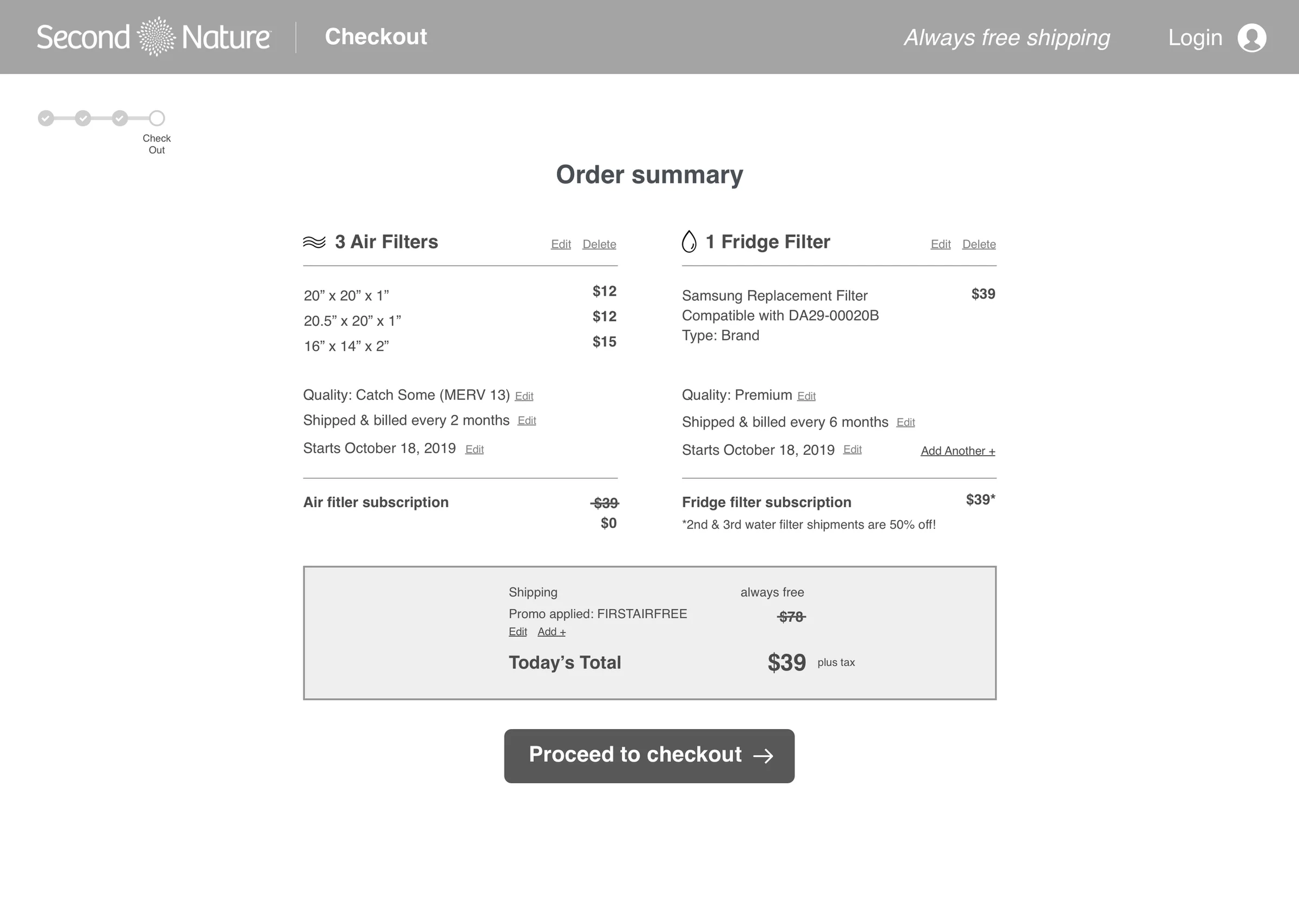
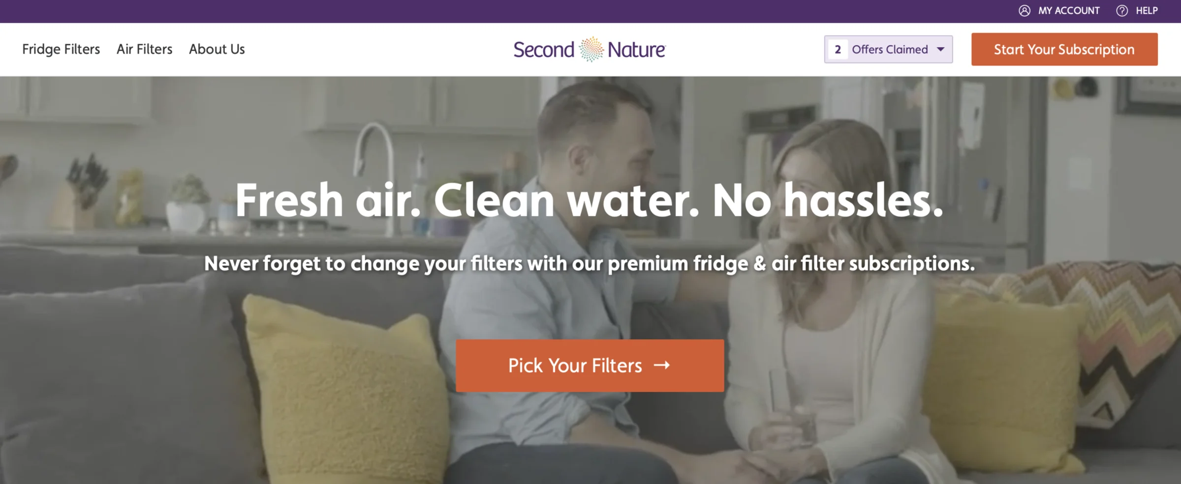
From there I built the IA, user flows, and wireframes around one unified content framework. One voice, one template, one product taxonomy, so the catalog could scale without one-off PDP variants. The visual direction went restrained and premium, with strong type, studio photography instead of stock lifestyle shots, and a brand voice that was confident instead of corporate. Specs moved behind an accordion. The product story moved to the front.
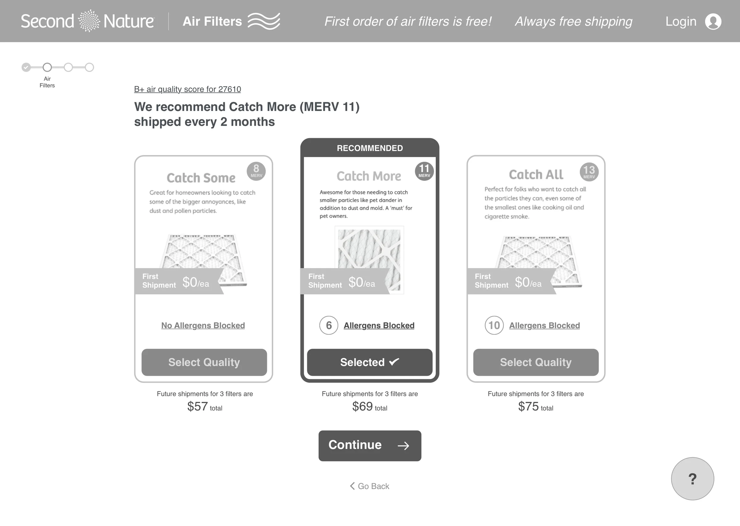
The single most important call I made wasn’t a layout decision. It was investing in photography. Replacing placeholder lifestyle images with prop-based studio shoots did more for brand credibility than any copy or tone exercise. I designed the wireframes and made the high-fidelity calls, and gave engineering design oversight as they built it out incrementally, every component live, measured, and iterated instead of shipped as one big-bang launch.
Photography is content.
The outcome
Conversion climbed six points in the first quarter post-launch and settled sixty percent above baseline by year-end. Click-through on the relaunched ad creative ran about double the industry average for the category.
The platform elevated the brand from a single-product infancy to a multi-product, brand-led growth stage. The UX and content platform the team was using when I left was the one we built together. It still ran the brand three years later.
One thing I learned the hard way.
A/B culture multiplies. A team that A/Bs by default ships faster and with more confidence than a team that A/Bs narratively. The lift was almost entirely downstream of “we test this in a week and ship if it works.”
What I’d do differently. I’d have invested in photography first. It was the most important call on the project, and I made it after the wireframes and the copy, not before them.