Panorama Education · Director & Design Lead
The 10-minute answer to a six-week consulting engagement.
I took over an AI product that turned a district goal into a ranked, evidence-backed action plan in about ten minutes instead of weeks. I owned the direction and design, partnered with engineering through implementation, and contributed reusable UI components. The beta reached 400+ districts in three months.
- Strategic plan to action
- Weeks to months ~10 minutes
- Goal to report
- Blank page Draft in ~10 minutes
- Graduation-readiness flags
- ~9,900 unresolved Resolved
TL;DR
- Panorama had the district data. Turning a strategic plan into a ranked response could take weeks or months of consulting work.
- I came back from parental leave, took the project over as director and design lead, and worked with engineering through implementation: paste a goal or attach a plan, get an evidence-backed report in about ten minutes.
- The report runs Assess, Investigate, Act. The work stays visible while it runs, reports persist, recommendations arrive flagged for review, and the product says plainly what it cannot do yet.
- The beta reached 400+ districts in three months. The product decisions behind that adoption were simple: make the goal legible, keep the work visible, and ask people to review AI recommendations before acting.
- Reports surfaced a 65% and 64% off-track equity gap and exposed credit errors behind about 9,900 graduation-readiness flags.
- What I'd change: pause, stop, and restart should have shipped with the first run, not after it.
On this page
The problem
My brief was to make a district leader’s strategic goal usable in one working session, then make the product trustworthy enough to act on. I owned the direction and design, and contributed reusable UI components alongside engineering.
Panorama had a data advantage with a practical gap. District leaders had attendance, academics, behavior, surveys, and life-skills data in the platform. They still needed a strategic layer that connected a district plan to the next decision. Turning that question into guidance could take weeks or months of consulting work. The opportunity was to make that reasoning usable in one working session.
The transformation sequence
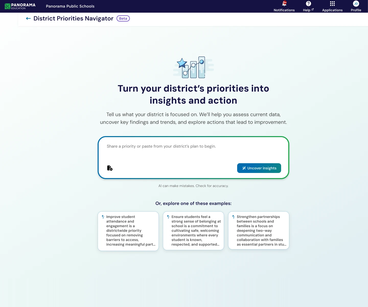
SequenceThe core product moment: the transformation from raw input to structured insight.
Panorama K-12
Data Foundation
Strategic Priorities Advisor
AI EngineFive kinds of district data converge before the advisor turns them into a priority view.
The Breakthrough
Bypassing the traditional consulting bottleneck to deliver instant, actionable insights.
Traditional Consulting
Strategic Priorities Advisor
Strategic Plan
Next Steps
Turning a district question into guidance could take weeks or months. The product made that reasoning usable in one working session.
Taking ownership
I came back from parental leave to a partially designed platform with a beta launch on the calendar. I took ownership of the experience, finished the design, and worked with product and engineering through implementation. The real risk was an AI feature that made an administrator’s job more complicated, not less.
I worked through product decisions in internal sessions with product and engineering, who had close visibility into district needs.
The design thesis was simple.
A district leader should not need to become an analyst to make a better decision.
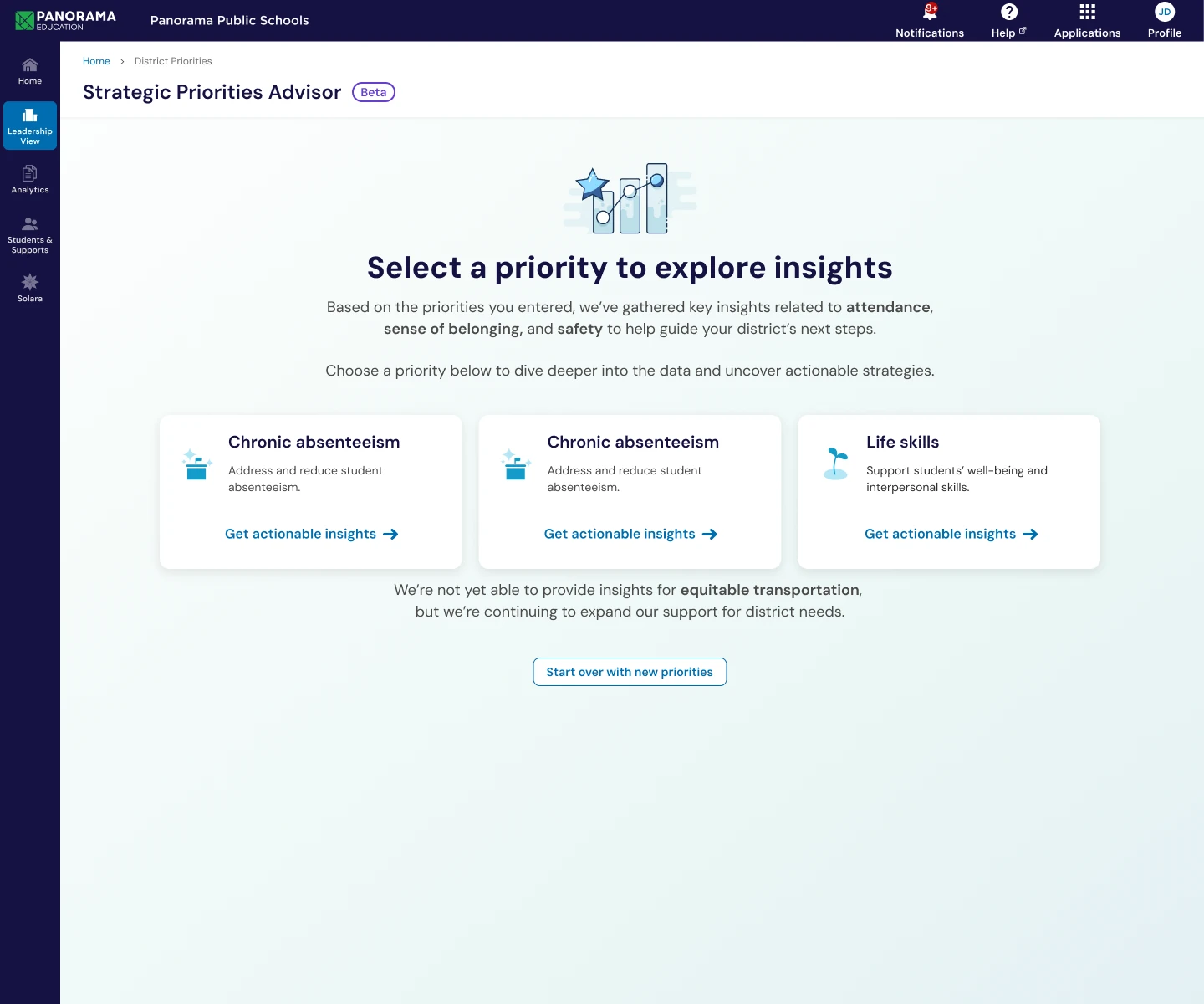
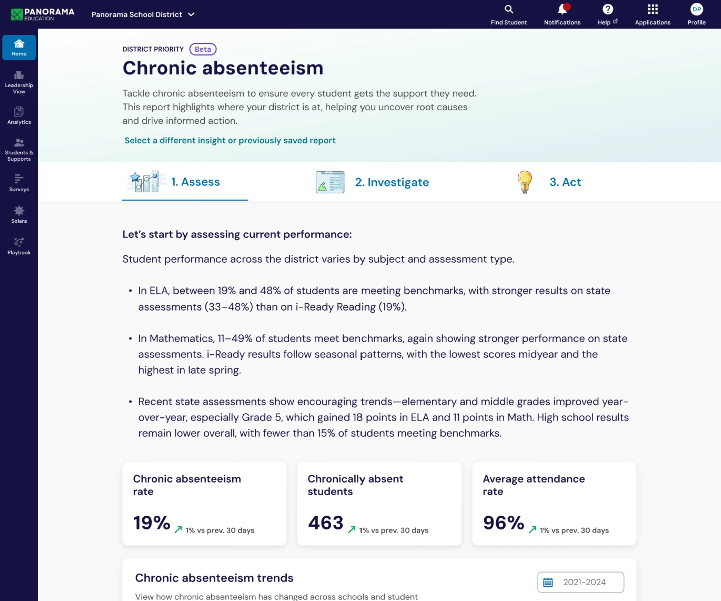
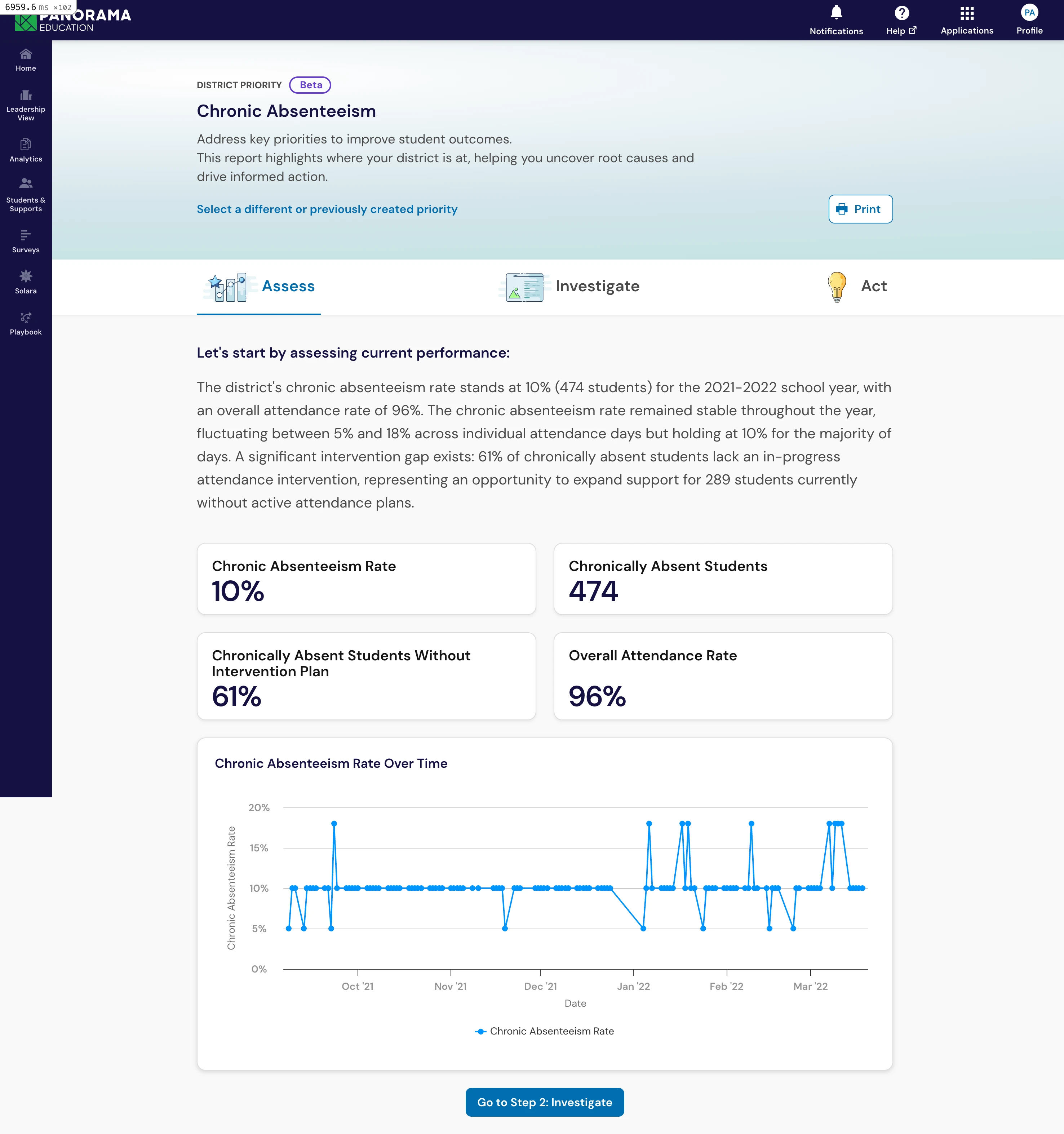
That led to three verbs: Assess. Investigate. Act. Assess makes the starting point legible. Investigate surfaces the patterns behind it. Act turns findings into next steps. The interface had to move from a useful starting picture, through the patterns behind it, to a next step someone could take. The sequence gave the report a clear structure, so a leader could tell what was ready, what was still working, and what came next.
From goal to action
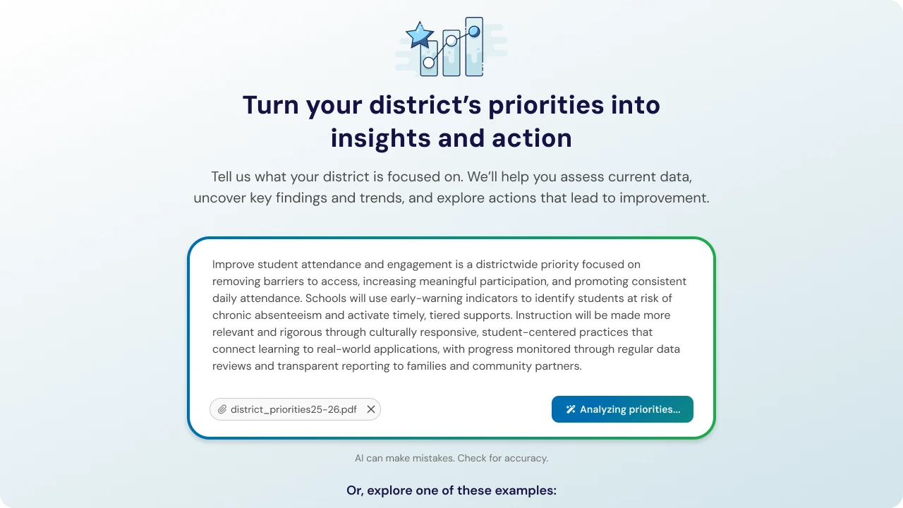
A leader starts in plain language. Type the goal or attach the strategic plan, and the advisor states what it heard, maps it to supported priorities, and brings the district’s data into the same view.
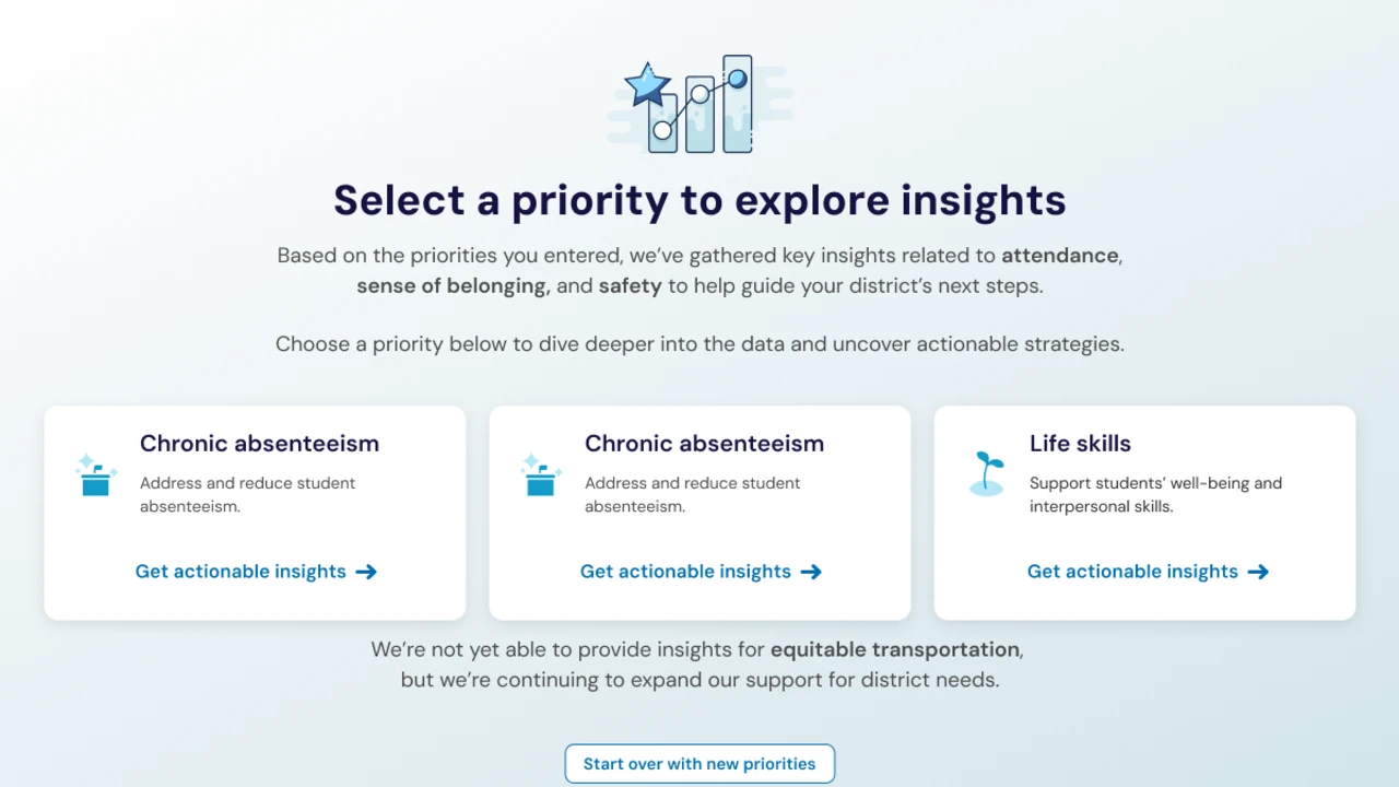
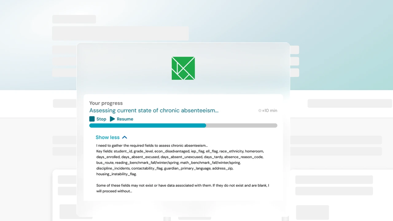
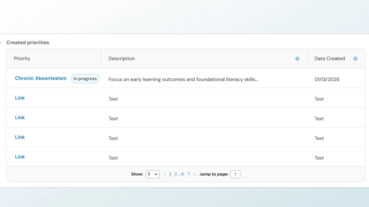
As the report completes, Investigate turns the starting snapshot into contributing patterns and supporting evidence. Act connects those findings to recommended next steps.
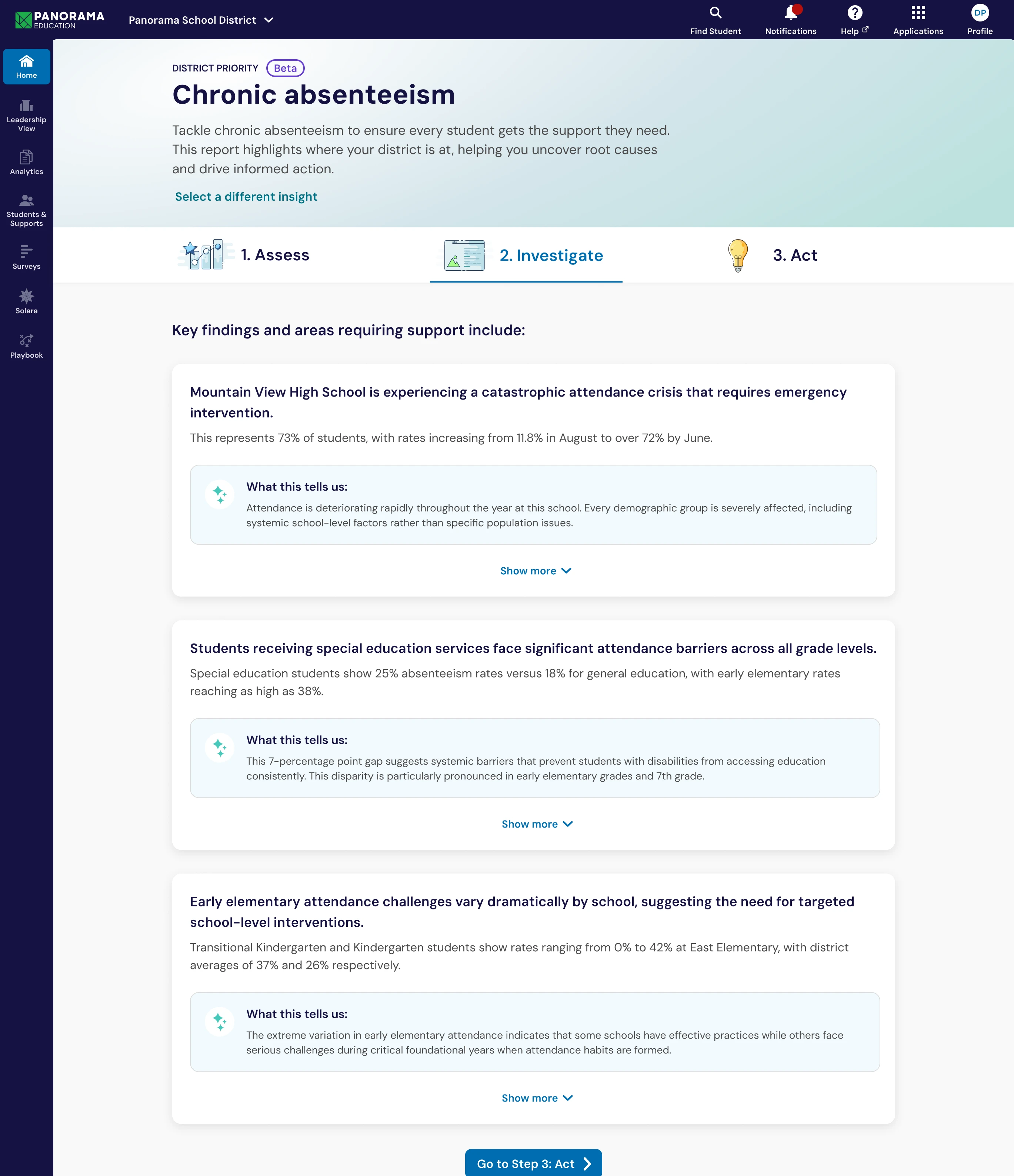
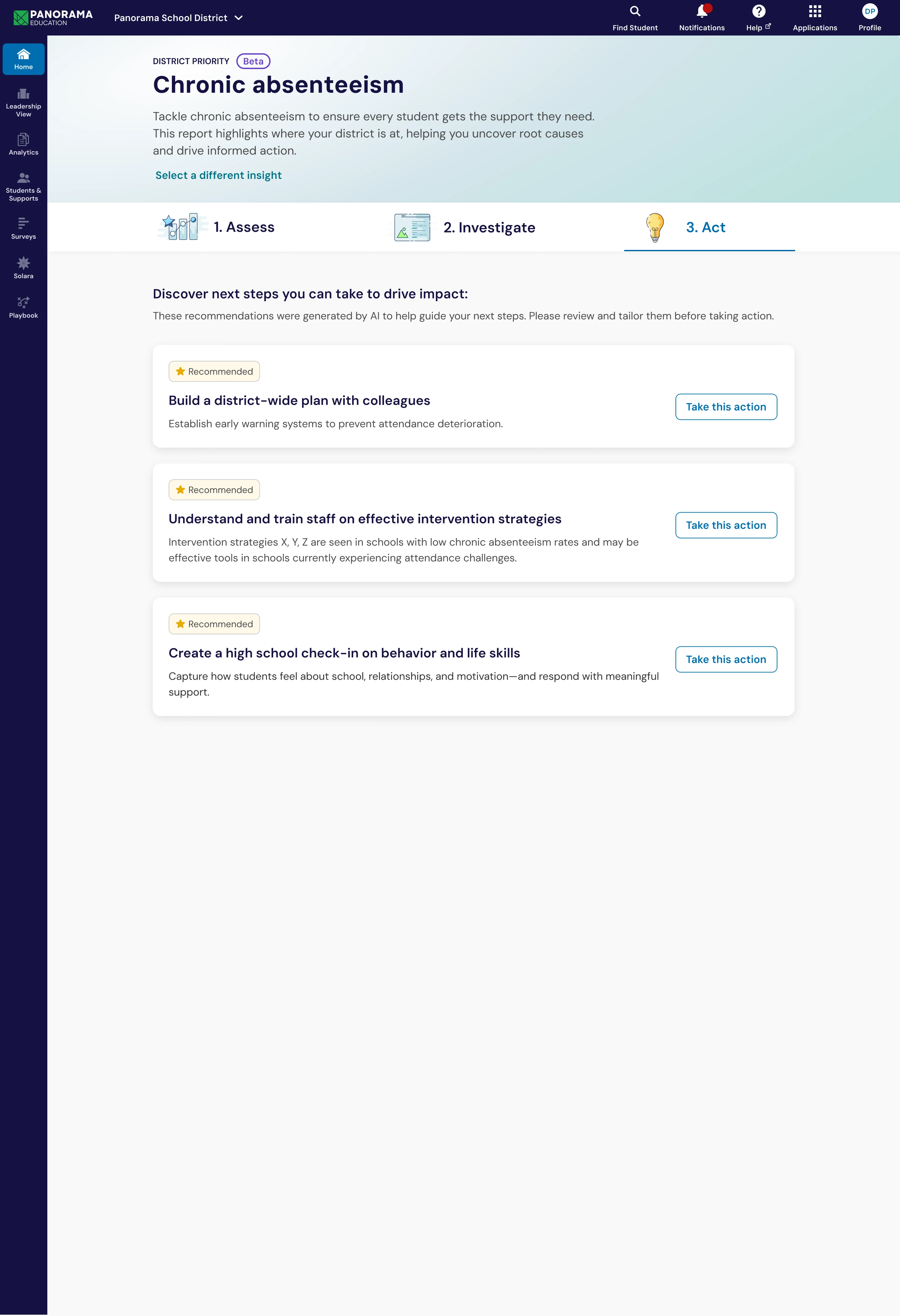

Act closes the loop with recommended Life Skills interventions. This representative view follows a different priority example than the desktop screens above; the zoom view scrolls the full recommendation list.
The system behind the experience
Ten minutes is long enough to lose confidence if nothing happens on screen, and most long AI runs shrink to a spinner. I showed the work instead: the goal stayed on screen, the fields being gathered stayed visible, and the run stayed put, so a user could leave and return to where it left off.
Mobile was not a smaller desktop pass. Dense charts lose value at 320 pixels wide, so the design paired a visualization with plain-language explanation and key numbers. The reader could inspect the pattern or read what it meant.

320px: the minimum supported width, where the chart alone is too cramped to explain the pattern.

The same Assess view at two widths. At 320px the chart tightens and loses context on its own; at the wider width more relationships become legible. The written insight summary keeps the takeaway clear at either width.
The report needed a system behind it. Composable patterns and tokens meant it could grow without turning every screen into a one-off.
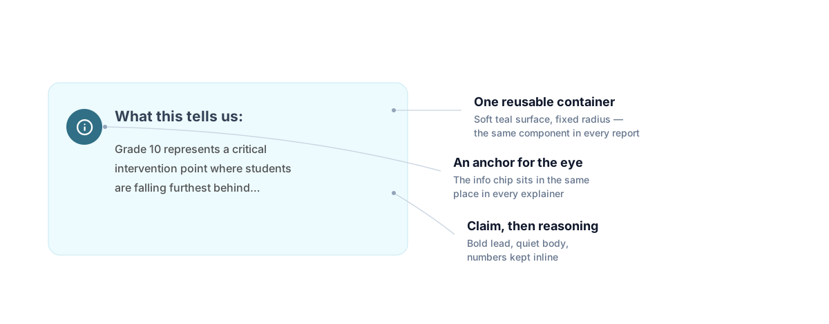
The explainer from the mobile captures, shown on its own. It keeps the product’s plain-language promise close to the finding.
Component Anatomy
Strategic Priorities Advisor was not a monolith. It was composed of clear, reusable layers: tokens and primitives build patterns like the goal builder, and patterns sit inside a page template.
The page is the outer layer. Reusable patterns make the experience easier to extend.
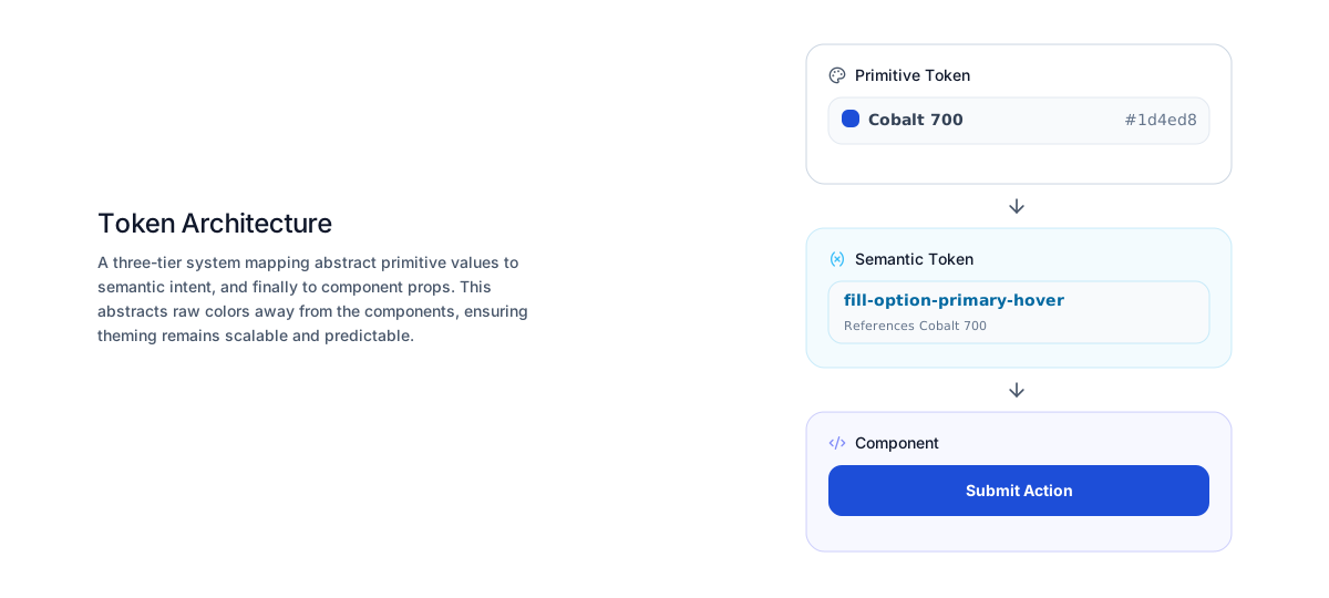
The broader design-system work treated accessibility as part of the component contract. We included ARIA states, RTL considerations, and axe-based checks in the delivery workflow. The diagrams in this section are conceptual reconstructions, not product screenshots.
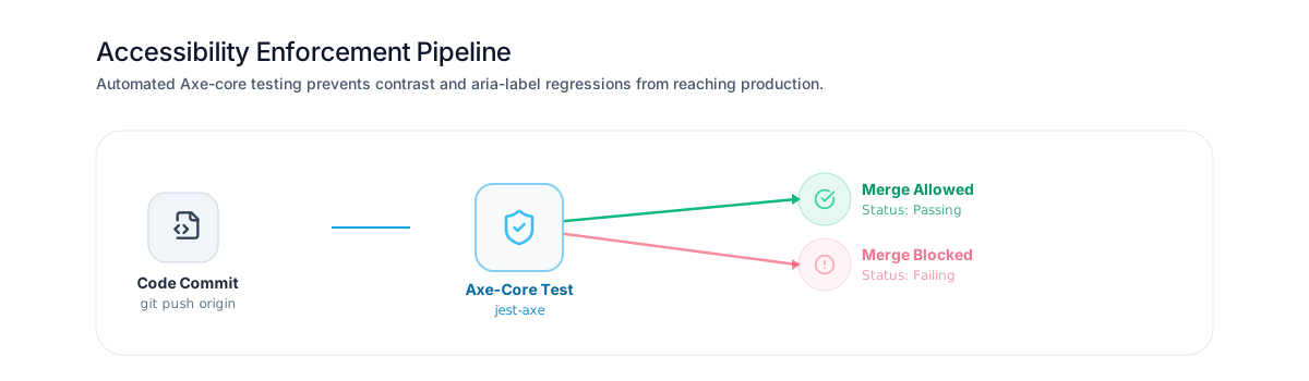
Accessibility checks run on every commit. A passing check moves forward. A failing check stops the merge.
The point was to help a district team decide what to do with the data on a Tuesday.
The outcome
More than 400 districts activated the beta in three months. Then the reports started returning findings that changed what teams looked at next.
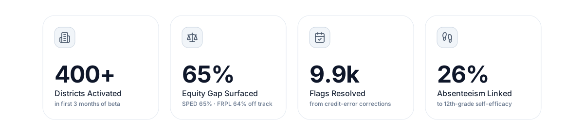
More than 400 districts activated the beta in its first three months, an early signal that the workflow fit into real strategic-planning work.
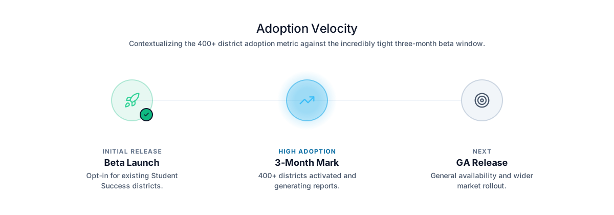
The beta gave the team an early signal that districts were willing to use the workflow as part of strategic planning.
The report flagged 65% of special education students and 64% of students receiving free or reduced-price lunch as off track for graduation. It did not explain the disparity by itself. It made the difference visible early enough for a team to investigate.
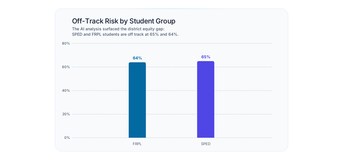
The report surfaced off-track rates among student groups, giving district teams a concrete place to investigate.
Fifty-seven percent of graduation-readiness flags traced to credit and scheduling errors, not graduation risk. Correcting the errors cleared about 9,900 flags. The product did more than rank risk. It exposed the data quality underneath it.
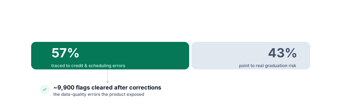
Data-quality issues can look like student risk. The report helped teams distinguish credit and scheduling errors from genuine graduation-readiness concerns.
A separate finding linked 26% of 12th-grade absenteeism to self-efficacy. Chronic absenteeism looked different when the report connected it to a life-skills gap. That changes what a team tries next.
What held up Showing the work during generation was the decision that carried the beta. A visible wait never read as a broken product.
What I’d do differently Pause, stop, and restart controls belonged to the first run, not the polish pass after it. I would ship them in the first release rather than adding them later.